Advanced SVG Transformations: Containers, ViewBox, and Groups
In previous articles, we learned how to move elements inside an SVG graphic, such as rectangles and groups, by modifying their x and y attributes or using matrix transformations (you can review the complete tutorial at this link). Now, we will take a step further: we will explore transformations affecting the SVG container, understand the viewBox attribute, and apply transformations to groups and simple elements.
1. Transformations outside the SVG: The Container
When we embed an SVG inside an HTML document, it behaves like any other element, such as a <div> or a <p>. This means we can apply CSS properties such as margins, transformations, or positioning, either via embedded CSS, an external stylesheet, or inside the SVG using the <style> tag. These transformations affect the SVG as a whole, not individual elements inside it.
For example, imagine you have an SVG inside a <div> container. You can apply CSS transformations to the entire SVG and show its original position with dashed lines:
<div style="width: 400px; height: 400px; border: 1px solid black; position: relative;">
    <svg width="200" height="200" style="position: absolute; top: 50px; left: 50px; transform: rotate(15deg); margin: 20px;">
        <rect x="10" y="10" width="180" height="180" fill="orange" />
    </svg>
</div>
Visual Result:
In this case, the entire SVG is rotated 15 degrees and a 20px margin is applied, all from the container's CSS. The gray dashed lines show where the orange rectangle was before the transformation, at its original position (10, 10) inside the SVG. If you like learning advanced programming, right-click on the example and select "Inspect" to see the underlying code and manually modify properties by disabling checkboxes affecting the element. Check image 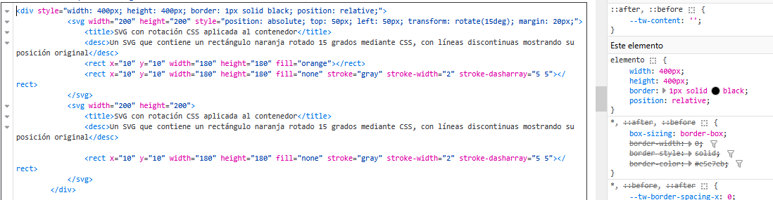 for more details.
2. Understanding the viewBox attribute: Your window to the SVG stage
The viewBox attribute is one of the most important in SVG, and while it may seem complicated, it is very easy to understand if we think of it as a window or a theater stage. Imagine the SVG is a stage where your drawings (rectangles, lines, etc.) are presented, and the viewBox is the window through which the audience (you) views that stage. The view changes depending on whether you are in the front row, close to the stage, or in the back row, further away.
The viewBox has four values: viewBox="min-x min-y width height". These values define which part of the stage is visible and how it fits the SVG size. For example:
- min-x and min-y: The starting position of your window (the top-left point of the stage).
- width and height: The size of the window, meaning how much of the stage you can see.
Let's look at a practical example without viewBox:
<svg width="200" height="200" >
  <rect x="10" y="10" width="80" height="80" fill="lightblue" />
</svg>
Visual Result:
Let's look at a practical example to see it in action:
<svg width="200" height="200" viewBox="0 0 100 100">
    <rect x="10" y="10" width="80" height="80" fill="lightblue" />
</svg>
Visual Result:
Here, viewBox="0 0 100 100" means the window starts at position (0, 0) of the stage and has a size of 100x100 units. Although the SVG has a physical size of 200x200 pixels (defined by width and height), the viewBox causes the 100x100 stage to stretch to fill that space. It is as if you "zoomed in" on the stage to fit the SVG window.
If we change the viewBox to viewBox="20 20 60 60", the window will move to show only a portion of the stage, from position (20, 20) to (80, 80). This makes the rectangle look smaller or shifted, depending on how it fits.
<svg width="200" height="200" viewBox="20 20 60 60">
    <rect x="10" y="10" width="80" height="80" fill="lightblue" />
</svg>
Visual Result:
The viewBox acts as a visual transformer of all its internal content as if we zoomed in or moved the content to make it larger or smaller.
3. Transformations in groups inside <svg>
Although we already saw this in previous tutorials, it is good to remember element grouping functions. Groups (<g>) in SVG act like folders grouping multiple elements so you can apply transformations to all of them at once. This is useful when you want to move, rotate, or scale multiple elements without modifying each one separately.
With CSS, you can apply transformations such as:
transform: rotate(45deg);/* Rotate */transform: scale(1.5);/* Scale */transform: translate(50px, 100px);/* Move */transform: skew(30deg, 10deg);/* Skew */transform: rotateY(180deg);/* 3D Spin */
Affects any <div>, <img>, <svg>, etc. transform-origin defines the point from which the transformation is applied (default is the center of the element): - transform-origin: center; (default value) - transform-origin: top left; from top-left corner - transform-origin: 0% 100%; from bottom-left corner. Animations will be covered in separate topics.
<svg width="200" height="200" viewBox="0 0 200 200">
    <g transform="translate(50, 30) scale(1.2)">
        <rect x="10" y="10" width="50" height="50" fill="purple" />
        <rect x="70" y="10" width="50" height="50" fill="yellow" />
    </g>
</svg>
Visual Result:
In this example, the <g> group contains two rectangles. The transformation translate(50, 30) scale(1.2) is applied to both rectangles together: they move 50 units to the right and 30 down, and scale to 120% of their original size.
4. Transformations in simple tags inside <svg>
Finally, we can apply transformations directly to individual elements inside the SVG, such as rectangles or lines, using the transform attribute. This is what we saw in the previous tutorial (you can review it here), but now we will combine it with what we have learned.
<svg width="200" height="200" viewBox="0 0 200 200">
    <rect x="10" y="10" width="50" height="50" fill="green" transform="translate(20, 20) scale(1.5)" />
    <rect x="80" y="80" width="50" height="50" fill="red" transform="skewX(20)" />
</svg>
Visual Result:
Here, the first rectangle moves 20 units right and down and scales to 150%, while the second rectangle skews 20 degrees horizontally with skewX(20). As you can see, each element can have its own independent transformation.
5. Combining transformations for more complex effects
Once you understand how individual transformations work, you can combine them to create more interesting effects. In SVG, you can chain transformations in the transform attribute, and the order in which you apply them affects the final result. Let's see how to combine translate, scale, and skew in a group and in an individual element.
Combining transformations in a group
In this example, we will apply an offset, a scale, and a skew to a group containing two rectangles:
<svg width="200" height="200" viewBox="0 0 200 200">
    <g transform="translate(30, 20) scale(1.3) skewX(15)">
        <rect x="10" y="10" width="50" height="50" fill="purple" />
        <rect x="70" y="10" width="50" height="50" fill="yellow" />
    </g>
</svg>
Visual Result:
Here, the group moves 30 units right and 20 down with translate(30, 20), scales to 130% with scale(1.3), and skews 15 degrees horizontally with skewX(15). All these transformations are applied to both rectangles inside the group.
Combining transformations in an individual element
Now, let's combine transformations in a single rectangle, applying translation, scaling, and vertical skewing:
<svg width="200" height="200" viewBox="0 0 200 200">
    <rect x="10" y="10" width="50" height="50" fill="teal" transform="translate(40, 30) scale(1.5) skewY(20)" />
</svg>
Visual Result:
In this case, the rectangle translates 40 units right and 30 down with translate(40, 30), scales to 150% with scale(1.5), and skews 20 degrees vertically with skewY(20). The order of transformations matters: translation is applied first, then scaling, and finally skewing.
6. Matrix transformations
Matrix transformations offer advanced control over transformations using the matrix function, which applies a custom 2D transformation based on a 3x3 matrix. This function takes six parameters: a, b, c, d, e, f, corresponding to the components of the transformation matrix. It is useful for complex combinations or when mathematical precision is needed.
Example of matrix transformation on a rectangle
Let's apply a matrix transformation combining translation, scaling, and rotation on a single rectangle. Matrix values are calculated as follows: a and d for scaling, b and c for rotation, and e and f for translation.
<svg width="200" height="200" viewBox="0 0 200 200">
    <rect x="10" y="10" width="50" height="50" fill="brown" transform="matrix(1.2, 0.3, -0.3, 1.2, 30, 20)" />
</svg>
Visual Result:
In this example, the matrix matrix(1.2, 0.3, -0.3, 1.2, 30, 20) applies scaling (diagonal values), slight rotation (off-diagonal values), and translation (last two values). This custom transforms the rectangle from its original position.
How we work with transformations on creadorlogos.com
How can you work online with transformations from our logo creator? At creadorlogos.com, you can use all kinds of transformations on the elements you place. Here is a step-by-step guide to doing it:
Step 1: Add elements
Add any type of element you want: text, icons, primitive shapes like circles or squares, through our right button menu. Check image 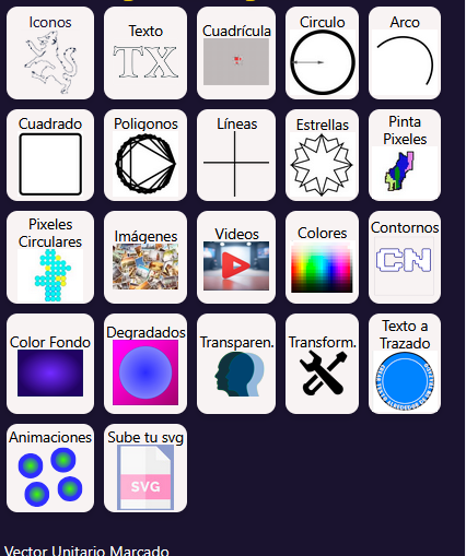 to see it.
Step 2: Select objects
Once you have the objects, you can select them by clicking on them or from the buttons generated on the right. Look at image  for more details.
Step 3: Adjust layers
Bring elements forward or send them backward for correct visualization using the element arrows. Keep in mind that top elements will overlap lower ones, and you can manage this by moving layers up or down. Check image  .
Step 4: Apply transformations
With the element selected, it is time to apply transformations. As I taught you in the previous tutorial, use the movement star to generate movements, scales, and rotations from the element center or one of its corners, pixel by pixel or with longer movements. Check image  .
Step 5: Transformation list
Here are the transformations you can perform:
- Move: Right, left, up, down of the selected element. If you activate the "child button", you can transform only the selected path and not the entire element (this option won't be saved, it only serves as visualization). Movement quantity depends on the potentiometer selected at the top of the star.
- Rotate: Right or left, depending on the potentiometer to increase degrees per click and rotation vertex selection (by default, everything rotates around its center).
- Scale and zoom: Scales the object, affected by zoom if the transformation vertex and potentiometer are locked.
You can also perform other types of transformations from the right menu. Check image 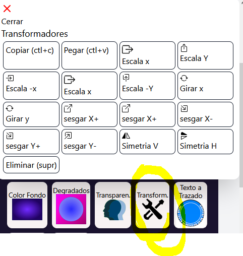 to see scales, skews, symmetries, etc.
Another important point: if you select a path and it becomes highlighted, press the Delete key to remove that path from the drawing (it cannot be recovered). If you press Ctrl + C and Ctrl + V (copy and paste), the entire selected element will be copied. If you want to copy only the path, select it and click the "select only..." button. Check image  .
With all this, you can make any composition you want and apply all transformations. As a note, on this website we apply 4x4 matrix transformations giving us freedom to create very complex animations and easily generate code. I encourage you to review this tutorial step by step and explore how to create free vector logos and animations from our page creadorlogos.com, download them, and generate spectacular animations.
In upcoming articles, we will teach you more advanced techniques for working with SVG, including transformation animations. We encourage you to keep reading my blog to discover more tricks and techniques that will elevate your designs to another level!